 This article introduces Funnel Diagrams as a novel way of simultaneously viewing both attrition and time – two important factors to consider when applying process
improvement to drug discovery.
Hirons L, Johnstone C, Sambrook-Smith C. Drug Discovery World Winter 2011/12, 13(1), 44 – 49
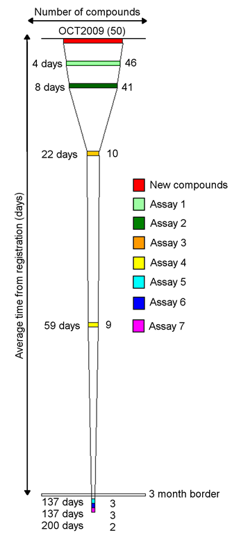
A single funnel is shown to the right. Each rectangle represents an event. Rectangle width
represents the number of compounds processed by that event. The distance between a rectangle
and the top of the funnel represents the average number of days from compound registration to completion.
Attrition is therefore represented by changes in a funnel’s width and time by elongation of a funnel
Below is a funnel diagram that gives a six-month snapshot of a lead optimisation project. Each funnel represents a month
with a trellis of 6 funnels giving a summary of how processes are changing.
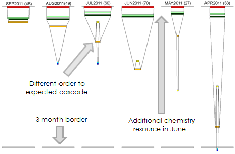
Highlights from the above diagram:
- Changes in the number of new compounds can be seen by glancing across the red rectangles. The sudden change between
May and June relates to the addition of chemistry resource. - In July the funnel folded back upon itself indicating an unexpected order of events
- Assays 1 and 2 are consistently completed within a week of compound registration, regardless of the volume of requests – indicating a minimal impact area for process improvements
- Variable timelines are seen for Assay 3, independent of throughput – an area to examine further